- Home
- Courses
- Cinema Exhibition Training
- Training for Non-Technical Cinema Employees
Curriculum
- 7 Sections
- 47 Lessons
- Lifetime
- Artistic Intent – Why We Are HereThe Producers and Directors all believe that if they make their vision come to life – make their story into a movie – it will be shown in a way that allows the audience see and hear what they created with the same splendor they realized. Were they wrong?2
- Quality Management BasicsIf something is managed properly, then there is control over the quality of the items being delivered, and assurance that the end user will be satisfied. Quality Management | Quality Control | Quality Assurance12
- 2.1Ideas Behind The Checklist
- 2.2Security and You
- 2.3Training and You – and the ISO 9001 Management System – Part 1
- 2.4Routines to Self-Certify – Checklists and Employee Training – Part I
- 2.5Routines to Self-Certify – Checklists and Employee Training – Part II
- 2.6How to: Manager’s Walk Through
- 2.7How to: Manager’s Walk Through – Part 2
- 2.8Units of Measurement25 Minutes
- 2.9Where to Judge The Auditorium
- 2.10Forensics, Encryption, KDM, CMS, FLM and 3 Letter Acronyms
- 2.11Alternative Content = Non-Cinema Tech
- 2.12Units of Measurement – Part 2
- Cinema Basics – AudioSome say that a movies sound is 50% of the movie. So, it better be good, eh?7
- Cinema Basics – PictureSound has nuance. Picture has a thousand words for nuance. Let's learn some.7
- Making MeasurementsYour picture and sound equipment get calibrated according to a schedule that management thinks is appropriate for your facility – sometimes in 6 month or 12 month or 18 month intervals. But we all know that things happen in between. With the right tools, you can become the judge.4
- Accessibility EquipmentSome of our customers use the large speaker systems to know what the actors are saying, some read the words with special "closed caption" equipment...some listen to special tracks on headphones. The equipment is called Accessibility Equipment. We have to understand it and test it to make certain our customer gets the best experience possible.14
- 6.1The Other-Abled, and You
- 6.2Accessibility To Inclusion In Cinema – Prelude
- 6.3Promise, Promises and Great Expectations
- 6.4The Access Community
- 6.5Accommodation, In General
- 6.6Accommodation, Open Captions
- 6.7Accommodation, Closed Captions
- 6.8No Technology Before Its Time
- 6.9Industry Coordination
- 6.10Different Paths; …and Finally, Results
- 6.11DCP Production – Narration and Closed Caption Creation
- 6.12Currently Available – “Personal” Closed Caption Solutions
- 6.13Specialized Audio Systems for the Blind and Partially Sighted
- 6.14Signing In Cinema
- EmergenciesLife happens in real time. Sometimes we read about it. More rarely, we are there. And after, we wish that we could have practiced a little bit before being thrown into it.1
A Look At Light – Part II
Compromise Is The Rule
There is a rule in technology.
Engineering is the Art of Compromise.
This rule applies to the sound as well as to the picture. It applies to the equipment that creates the sound and picture. It applies to safety equipment. It applies to the carpet that we walk on.
It means that there is always a trade to make between speed or size or cost or portability, or the push to be the greatest …and especially if we try to be the cheapest.
Maybe you want more light on the screen. But that will give you more scattered light too – all over the ceiling and sidewalls – and that is not a good thing for contrast. Or you might think, “OK, I won’t let it scatter, I’ll direct the light using curved screens and screens of different materials.” But directing light will bring you ‘hot spots’ and that can be worse.
In our daily lives, we are surrounded by the decisions of designers who must balance these things everywhere.
Testing the Compromise
There are machines, tools really, that will test light and sound. They are usually very expensive, and they require very trained people to set them up and to use them properly. The trick is to take the measurements properly – usually at several positions in the auditorium – and also to analyze the results properly. The problem isn’t only that the equipment costs 15,000 to 30,000 dollars or euros. They also consume expensive technician time.
So, there is the trade-off, the compromise. We can make the projector and screen perfectly calibrated every week. …or perhaps every month. But probably it will be every 12 months or 18.
A very big company might be able to afford the equipment but only one set per region. They also might have one person to do the tests per region, but this person also has to fix major problems or monitor new construction. It I very rare to have a staff that can go to each cinema auditorium every year. The solution might be to hire an outside service, but that can be even more expensive.
There is only so much money coming in from the sale of tickets and popcorn and sugar-water.
One of the compromises of digital cinema equipment was that they make a fine picture without a lot of employee interaction, but they are incredibly expensive. When compared to the mechanical film projectors that they replaced – which used to cost ¼ as much and lasted 50 years – it seemed like a dangerous move. How many computers do you know that last even 5 years? 10 years? The studios benefit from lower print costs and shipping costs. But the cinema could only benefit if the equipment is more stable, and costs less to maintain. Which turned out to be true.
So, a good compromise. But it means that there are less professionals in the facility to judge the quality of the sound and picture.
Well, how about the test tools that cost 6,000 dollars or euros? The quality might not be as good as they real expensive ones, but are they are good enough for some purposes?
Absolutely. But again the compromise. How often does something go bad, and how bad are the effects of that happening?
Maybe a show is lost for a day, or more rarely, a week. Is too much red in the picture or a rattling speaker going to make the people leave? Will they notice? Will they say something, perhaps ask for a refund? Or will they notice and just never come back?
The compromise is that it isn’t worth buying even a less expensive unit, and leaving it for an untrained person to lose or break. There is some equipment that doesn’t cost as much and doesn’t need any human intervention, but they are quite weak in abilities. They are not positioned in the proper place in the auditorium to duplicate what the audience sees and hears.
Humans Can Test Too!
So, this is where we human beings come in. We have over a million sensors in each eye, and almost 25,000 detectors in each ear. We may not be able to count wavelengths and levels with as much exactness as a microphone and color sensor, but if we learn how to look and listen, we can do what the job requires, and we can be aware of things…we can report things…even some things that a machine just isn’t able to do. And, get this, the phone we carry around is able to give very accurate clues too. …as long as we are aware of the compromises, because …everyone repeat…Engineering is the Art of Compromise.
Ingredients: Color
Let’s take another break to learn a little more about color.
This time we will go to a site that has great comparisons of different color spaces.
“What is a color space?”, you might say (…and silently, of course, you might think, “Why should I care?”)
Imagine a world in black and white, with a few shades of grey. You really don’t have to imagine that. Go into a closet or wander the halls when it is dark. At some point it is so dark that there is no color, but you can see several different shades of black and grey. At some point – even more dark – you can only barely see your hand in front of your face. That point is 2 colors. Black hand, one tone of grey surround.
Sometimes we will see this in the movies, and the director will pop a single color into the frame…a red or a blue. How deep is that red. Bright? or Dark? How many shades of that one color are there? 10? 100?
The computer in front of you can probably show 256 shades of red, 256 shades of green and 256 shades of blue.
Combine that all together, that is a lot of combinations. But it can’t show deep deep green, or deep deep brick red, or deep deep blue…if it tried, the blue would just show the same as black, the deep red would show the same as black, the deep green as black. But some screens can show many more color combinations than that. Because computers usually double things as they progress, the next step up is 512 steps of green and red and blue. Then, 1,024.
Ah! Gotta answer the question, “Who cares?” Because really, we are looking at a page that is only maybe 1,000 pixels wide. The answer is, no one cares when the screen is only a thousand pixels wide. Well, maybe someone who spent a lot of money to advertise a jacket that goes from deep deep blue to kinda deep blue. Or the director who wanted to show the colors of the sky in the sunset.
You can see it in the picture below. There are some clouds, but there is a lot of areas that are just not ‘right’. Some of the colors bunch up then go to the next level. We call this banding. Some parts are splotchy. That is partly the problem called compression. Compression is a trick
Stretching out that small range of colors with only a few choices is very difficult and causes the “banding”. The standard for the projector and screen in the cinema theater goes past 1,024 per color, past 2,048 per color, all the way to 4,096 shades of red and green and blue. So when you watch Lawrence of Arabia on the big screen, it doesn’t look like it does on YouTube or Vimeo.
Let’s look at this together. The big shift from darkness to sunrise in this clip shows some amazing things. You can find copies of this that look incredibly bad. Instead of being a smooth range from the brightest orange to the darkest. If this were a painting, the artist would be blending the colors on the pallet very cleverly. Me, I would try with a few crayon colors and give up.
But Hey! Maybe crayon colors is a good comparison. Imagine drawing the screen below, before the movie starts. First, the black surrounds. Then, in the top corners almost a grey-brown, then for the brightest part a dark orange. So, could we make that with a combination of black and orange? 2 colors is all we need. The color pallet is 2 colors but the range is …oh, look closer…the range is blotchy. The closer you look, the more that you can see that there are blocks of colors that trade off being dark and lighter, but not a pure gradient. Seems like the science people have figured a way to trick the eyes. They call it, adding noise.

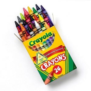
 Imagine again trying to create the first shot of this sunrise with the first box of Crayola™ crayons. You may be able to do it, but when the movie plays and the sky gets brighter and the colors get more complex, it sure would be nice to have a bigger box with more choices!
OK; Road Trip! The next time you can, go to the Apple Store and stand in front of an iMac with the 4k or 5k screen. Go to the following website and look at the first example. Move the bar back and forth. Interactive Wide-Gamut Comparisons.
This shows a concept about color spaces that we didn’t discuss before.
When we look at a normal computer screen, the deepest red, the most blue blue, the best green – screen manufacturers follow a guide so that a designer knows that a certain color that they want to show will be similar when it gets to the screen in front of you. These standards evolve as better screens get cheaper and more accepted in the market.
Now, for a last distraction to give another view of color spaces, let’s go to Wifflepixel again. Click on: Color Spaces, Color Profiles and Gamma Correction This time, please don’t read the entire thing since it deals with things far above our need to know at this time – it gets too complicated too quickly. But go down to the first set of color drawing that looks like this and twirl it around a bit:
![]() then click on the buttons until you see this:
then click on the buttons until you see this:![]() and move it all around.
and move it all around.
Notice that the ‘box’ of color are larger in one selection than the other. There are actually 4 choices, and there could be 6 or 10. The important part is that you should know that movies are shown in a color space named P3 which is pretty large. P3 is a large box or artist palette of colors for the director and cinematographer to use. This means more lighter and darker blues, and more lighter and darker reds and more lighter and darker greens…and when mixed together, lighter and darker yellows and cyan and magentas.
Cinemas are better than most television monitors in other ways, but this idea of color space is a major one.
Comparing a computer based device to humans is not very useful. There are many things that humans are and can do easily that a computer cannot do.
But one thing that a computer can be that people have a hard time being – Consistent. If we ask a computerized tool to make a measurement every day at 6AM, it will. We get distracted by other chores, or being tired of other chores. Life sometimes throws us a variable; the car doesn’t work, the child is sick, the this, the that. How does our carbon-based/oxygen-buring body compete with the silicon-based electron-eating computer system?
We just have to get through our checklists with a DCP playing in each room every week. Each slide of each test DCP is actually a different tool. The first time we see the different slides, we won’t know what story each one can tell. But after a while, you may think, “I never noticed that line going across the picture being jagged…or not as bright…or blurry.”
You may not be sure of yourself the first or second time you see it. No one is until they have see or heard something several several times. But any of those things are a perfectly good observation to pass on. And as you find yourself being right and noticing more, learn to be sure of your awareness in the future. And if you are wrong, ask the technicians how you got it wrong.
You may have been perfectly correct in your observation, but not correct in the significance of the observation. No big deal…it is part of learning. You are trying to make their life easier and more efficient.
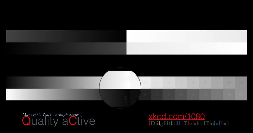
The following picture is something that you will see a number of times, perhaps in different variations.
The top bars are two gradients of 90% to 100% black and 100% to 90% white. The second bar has the two gradients reversed. What can you do with them?
Basically, they should be perfectly smooth – you shouldn’t be able to see any ‘banding’ steps in the gradient at all, or any splotches.
The same is true for the left side of the lower bars which are a set of 100% black to 0% black (which is also 100% white of course) and the bar below is the reverse. There should be no steps, and the difference with between them and the difference between the black background should be clear.
The magnifying glass won’t be on the master, only on this instruction sheet. But it is here to show where you should see 3 sets of the numbers ‘100’ and ‘0’ if the projector is set up well. If you don’t see numbers at all, then there is a problem to report.
You might report only 2 showing, and the tech may tell you that this is the best that a certain projector can do. But, the tech might also point out that a different machine should show 3, and you should point it out when it doesn’t. Which brings us to the most important point.
We are looking for differences. There used to be 2 numbers showing in the white, and 3 showing in the black, and now there is 1 in the white and 2 in the black…that is not a sign that things are getting better! …we want to report the problem before the customer notices that things are not as bright or doesn’t have as much contrast or that the darks are too muddy… 
You might also use this slide to help detect bulb flicker.
Bulb Flicker is the effect that happens as a bulb in the projector gets old. Sometimes, it won’t be old, but mis-aligned. It is possible that you can catch a bulb that is misaligned before it completely damages itself. This will give the bulb hundreds of extra hours of life. Rejoice. You have saved hundreds – possibly thousands – of money units.
Sometimes you won’t notice bulb flicker when directly looking at a slide up close, but if your head turns to the side a little you will notice that the light looks like it is beating with a slow or fast pulsing or flickering. All bulbs do it as they get older. Customers may not notice it at first, but they will be annoyed by it as it can make a person uncomfortable. Definitely let the tech know when it gets pretty strong.
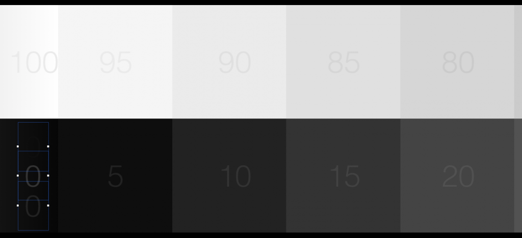
You may notice in the boxes that it seems as if the colors at the edges of the little squares are darker than the box itself…like there is a ramp up or down at every one. But if you get close and really look – maybe look through a box that you make with your fingers – you will see that each box is perfectly flat in color.
This is the Mach Effect. It is an optical illusion. Inside the boxes is only one number, and you should be able to see it. Technically, on the top row the number is 5% darker than the shade of the box. On the bottom row the numbers are 5% lighter than the shade in the box.
50% is repeated at the far end, with one of each on top of each other. If you can’t see the difference between two boxes that are 5% apart from each other, that would probably indicate a problem to mention. That could mean the contrast is getting worse. 95% and 100% should not look the same. 90% and 95% should not look the same. The same for 0% and 5% and 10%.
On the Checklist you will be asked if you can see all the light or dark colors separately. You should type in that some of the boxes look the same.

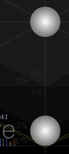
And, finally. This blown up example won’t look as good on your computer monitor. But it will hopefully look great on your movie screen!  Here is a different thing to look for. In this shot you can hopefully see that there is a 1% difference between the different diamonds of the slide. The circles should have a nice bright dot in the center, not grey!
OK; that’s a long enough lesson. Get out there and start looking – hopefully it will be more fun than all this reading. But maybe come back after a week of observing and read this again in case you missed something. As always, ask questions.