- Version
- Download 13
- File Size 145.13 MB
- File Count 1
- Create Date 2023-06-25
- Last Updated 2024-05-11
Radial JND
We begin this piece looking at the standard depiction of colors, provided to us in 1931 by the CIE (International Commission on Illumination) – a horseshoe created by bending the linear scale of light's wavelength. The outside colors are the spectral colors and in the 'center' – known as the whitepoint – is the color white. In between are shades of white blended with the spectral colors.
To skip the Lessons for the Non-Technical Cinema Employee and just download – The download password for the drawings is the same as always: QC_b4_QA
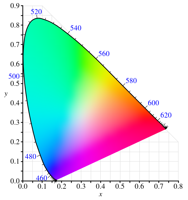
Why do this twist? The more easily accessible chart of colors given linearly – from the lowest wavelengths of light that the eye can see, or the frequencies of light (inversely proportional to the speed of light). The reason to make the horseshoe is because there are a few mechanisms that can be achieved by such construction.
For example, a line starting from the extremes of red or green or blue can be drawn through the white point will land on the secondary colors – Cyan, Magenta and Yellow. In the additive world of light, that is, light given from an emissive source (the sun or a TV screen, for example), the combination of R, G and B turns white. In the subtractive world the sum of C, M, and Y (reflected light from a page on a book for example) the combination will give something close to black …it should be black if the dyes used were perfect, but since they rarely are, a printer for example, will add black ink to the mix.
We think of these different uses as color spaces. They define mathemematically what could be if the monitor were ultimately capable, or if inks were full range and perfect. The first thing that we learn though: there is no achieving perfect red and perfect blue or perfect green with our lights or inks. So, often, when we see the horseshoe there will be triangles inside, with the R, G and B points inside the grand horseshoe. The line through the white point will still go to the opposite color, but we don't get all of the shades of colors. The colors that a mechanical device can provide are called its gamut.
What neither this color space of the CIE or the presentation of the gamuts inside show are the spectral colors going to black. Does that matter, and would an image having that give us any superpowers of being able to draw lines through the white point to another color? Probably not, or someone would have done it before. And no one has. Until now.
The download button on this page will give you a set of slides with all the colors of what is called the 2020 color space as defined by the ITU (International Telecommunication Union) as Recommendation BT.2020 and commonly called Rec 2020. Rec 2020 brings the green point much higher in the horseshoe, and extends the blues closer to the spectral point and the reds deeper toward Infrared. It also brings TVs into the world of 10 and 12 bit colors, though there are few 10 bit screens and 12 bits is still only the domain of cinema.
Another benefit of twisting the frequency of the light scale to a horseshoe is that we can pinpoint a color and give it a number by looking to the scales on the bottom (the 'x' scale) and the scale on the left (the 'y' scale). In the cases of the color space on the CIE drawing, the white point is x=0.3127/y=0.3290. What is that good for? Well, it is good for specifying what every projector in the cinema universe should have as the white point, and, as well, it is good for specifying the exact R, G and B points.
Imagine if the director worked extremely hard to get all the different shades of green in the Italian vista shot, and the green in the colorist room was off. It would not be reproduced the same in your cinema auditorium.
Let's be clear though. We are in the middle of a transition. In the same way that sound can be more immersive, the on-screen picture has a big moment in front of it. And that moment is …drum roll please~! after 10 years of "any minute now", lasers are actually making a move into the next layer of acceptance.
Which brings something called High Dynamic Range. This "HDR" is the ability to put more light on the screen and more darks. Simply put: The fold on the pant legs under the table will be more subtle and the diamonds will have more sparkle.
But more to this topic, they will be able to deliver more colors, closer or exactly to the specification of Rec 2020. Which is the color space that these slides are in.
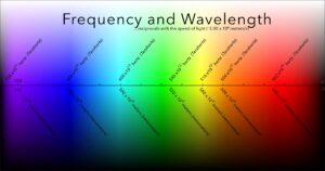
These are a 2nd way to put all the colors of the spectrum into view at the same time. The training slides of Frequency and Wavelength do similar, but from top to bottom.
22 Slides. 2 Pairs, Scope and Flat. All in the 2020 space, excepting a few for publishing and trying on in a Display PC device like the iPad over there.
These are called JND because they are, yet another science experiment. If a 709 version of this slide were put onscreen, it would show what colors were available in the 709 color space since the P3 projector can create these colors. The primary colors would not be so brilliant or deep. They would edge out to black more quickly and there wouldn't be as many colors toward the white either. The same would be true of P3 in comparison to the 2020 slides played on a 2020-capable projector.
The grid on top of them will help. In the 709 example, 3 or more squares might look all the same. In the P3 example, only two squares might look the same.
In the 2020 example on screen, the eye should be able to see that every square has a different shade of color.
This ability to notice colors changing is called Just Noticeable Difference, or JND. It works with sound as well.
So, this is an attempt to help a group be able to judge what they see over time. If we can see the change from every two squares, then 3 months later every 3 squares, something is degrading. Or maybe it is just popcorn butter on the port glass. Whatever it is, a tech should be told.
There are many variations in this set. One set is white to black and the other is black to white.
Eventually we will make the same thing in 3840 x 2160, but for now these are all in Cinema 4K, 4096 x 2160.
The passcode seems to be the same as always:
QC_b4_QA
Please let me know how these work out in the real world. I'm a little like Beethoven in this case, unable to see the finished product because no one has sent me a 2020-capable projector to try. …or a dark dark room.
Cut and Paste...should. be. Cut and Destroy – Don't read any
There are 4 slides in this set. 2 are were created and saved as TIFFs in the 2020 color space and 2 were created and saved in the DCI-P3 color space.
[To be clear for those not in the cinema world, DCI-P3 has a different white point and a 2.6 gamma curve, while many people's television sets are now getting Display P3, a variation that Apple has converted to an international standard.]
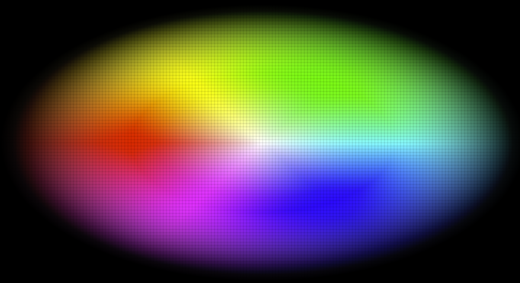
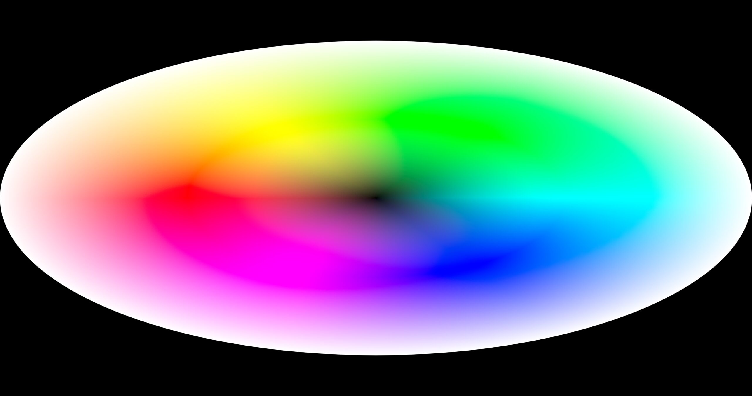
The pairs are composed of all colors in each space in a radial pattern, plain and with a grid overlaid.
The color radials are composed with the center being white and the outside edge being black.
Each Radial is 4096 x 2160. The P3 image presents itself as smaller even though the design and the mask are identical – one guesses that this is because the mix of black is going to the same edges, but begins more quickly in the P3 space (???). You can also see differences between the P3 version and 2020 as the monochromatic colors go to white as well.
And, no, there is no reason that these couldn't be done in a circle – it is just that the screen is a rectangle and that is how the design started. If you want a circle or several circles, ask.
Anyway, these will next be shoved into FCPX to create a PQ 300 nit version for each, but that is a ways away.