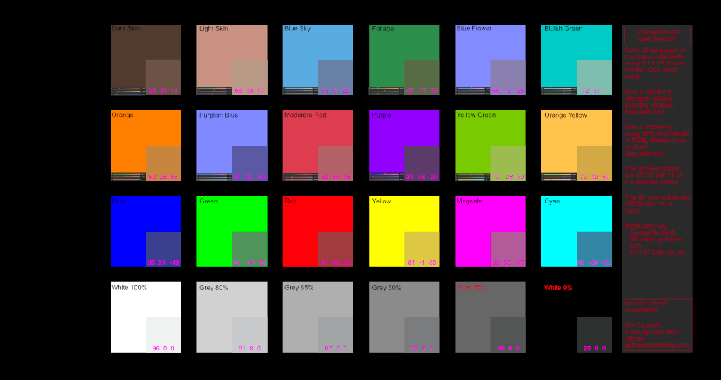
The GretagMacBeth chart is part of a long and great history, bringing a standard for comparing an input with an output. It is now ‘owned’ by the Colour specialist company x-rite.It seems to have come from the printing world and migrated into photography, then into the 709 HD world. Take a shot during production and you have a comparable standard when you get to post.
Cool.
DSC Labs has several more modern charts applicable to these modern days of 13 stops (Webinar: Test Charts for Production) – but that isn’t the reason for this experiment. Just a learning process, and now, needing comments to improve it.
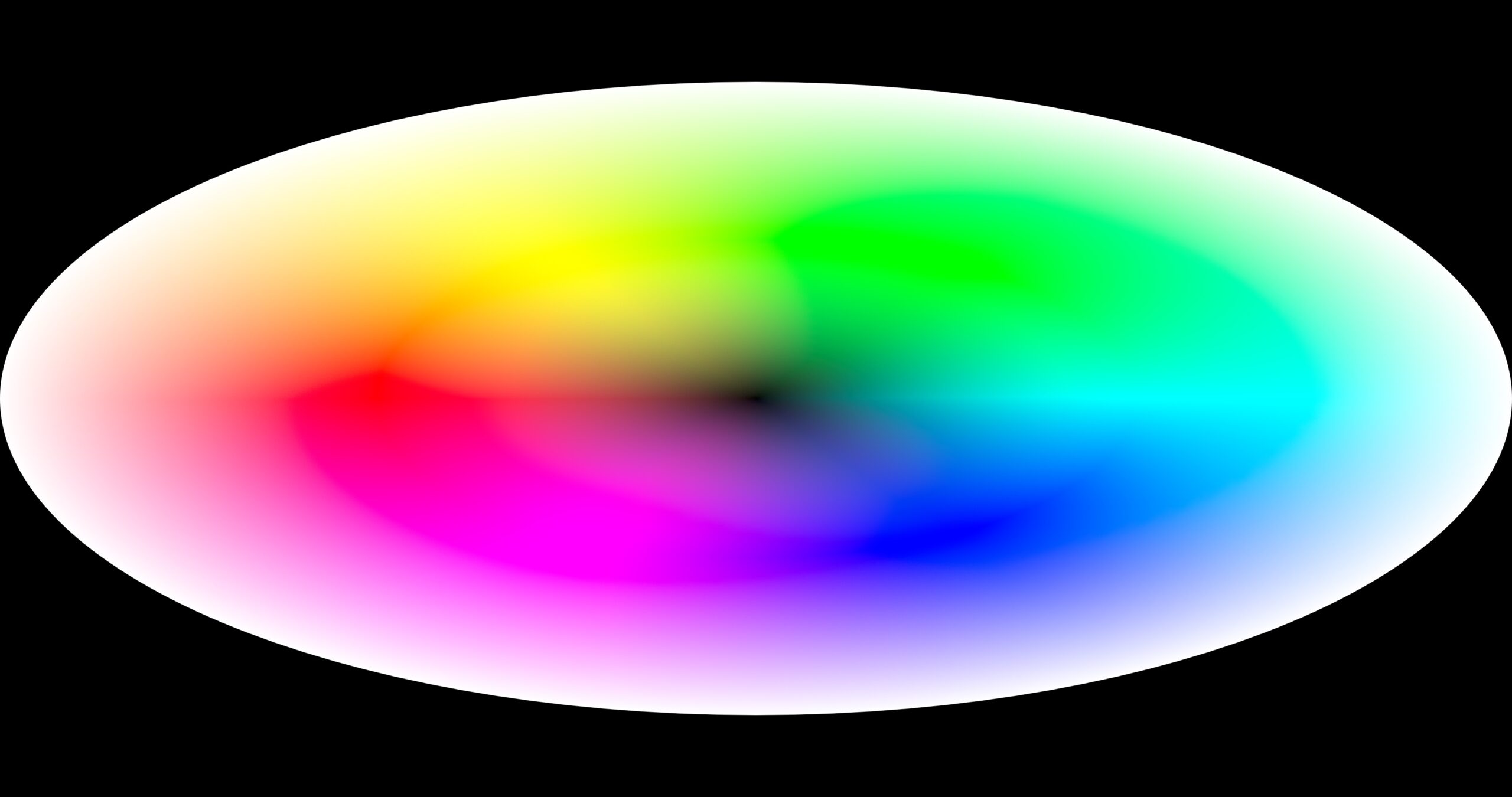
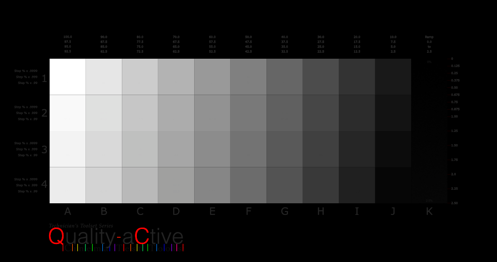
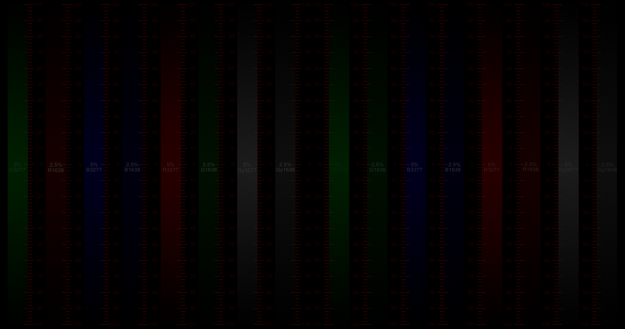
In this case, imagine a MacBeth chart being made today. Row 3 is easy – crank up the primaries and secondaries to 100%, and go for those greys on the 4th row at exact percentages. (I must admit that the first version I made an attempt at 18% in the penultimate position, but now it is just the boring original percentages.
Rows 1 and 2 were more difficult. The original patches are in the bottom right hand corner and it seems unbelievable that these are sky blue and whatever else they are named. There is a screenshot of the RGB slider positions – the attempt was that each was at some 25% notch, excepting the skin colors which are “Who Knows?”
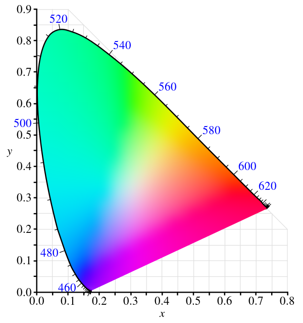
This chart is designed in the 2020 color space and in 16 bits. There is a 2nd slide that places an original chart behind to validate that the patches are correct. They were derived from L*A*B* colors. But transferring color spaces and white points may be illegal in your country, so be cautious.
Download Passcode: QA_b4_QC
For the sake of learning and discussion of the science, the attached file here is a study of colors – more corresponding to the descriptions of the colors than the ones chosen to represent them in the smaller color space.
This download document is a 16-bit 2020, 4096 x 2160 TIFF file. It was made with Affinity Designer, the file of which is included in the zip.
The details on the right of the images says: Conceptual Art and Science
For all the lawyers out there:
Not for profit. Merely an educational experiment.
Ideas Wanted – [email protected]